CHALLENGE
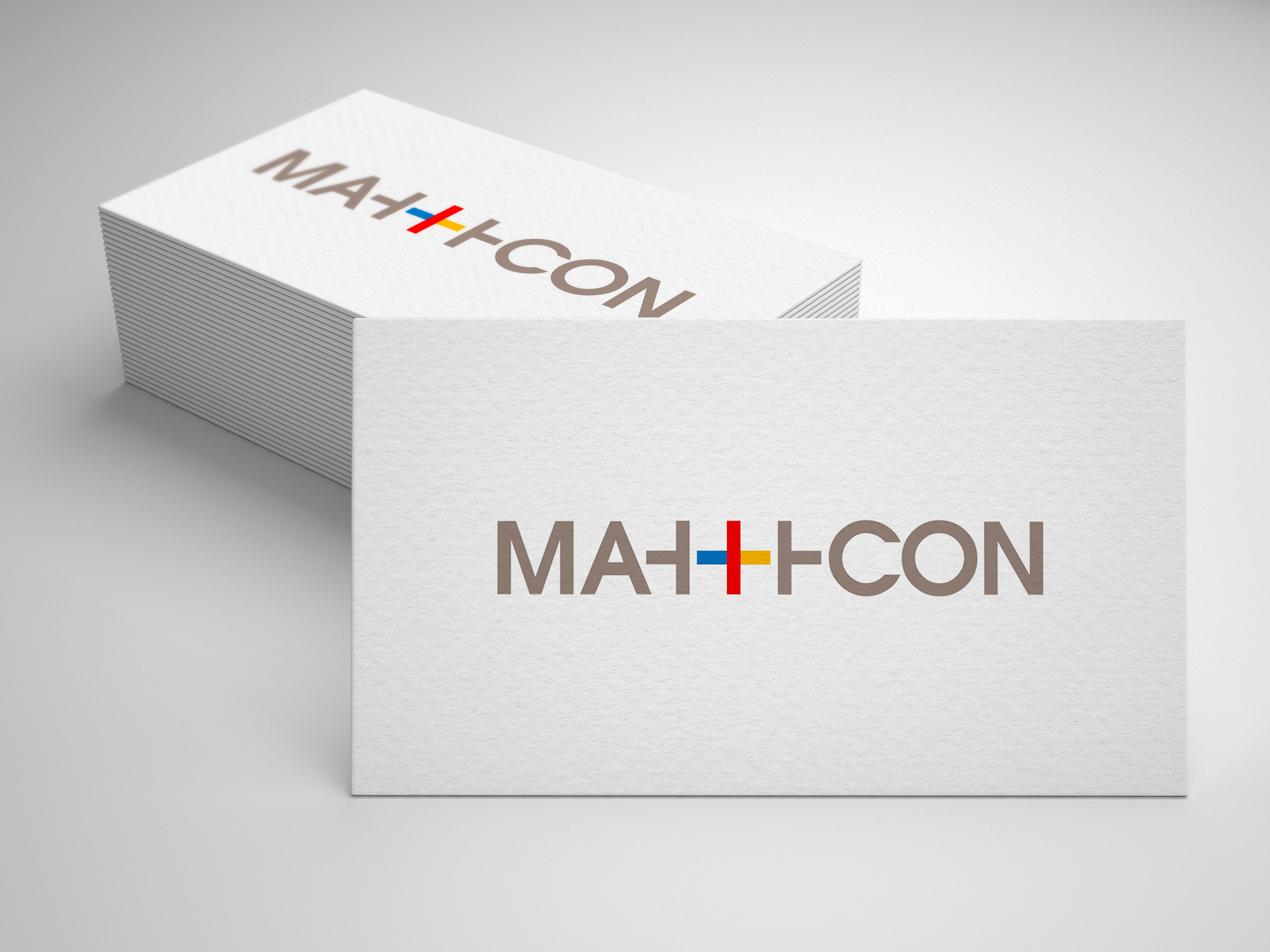
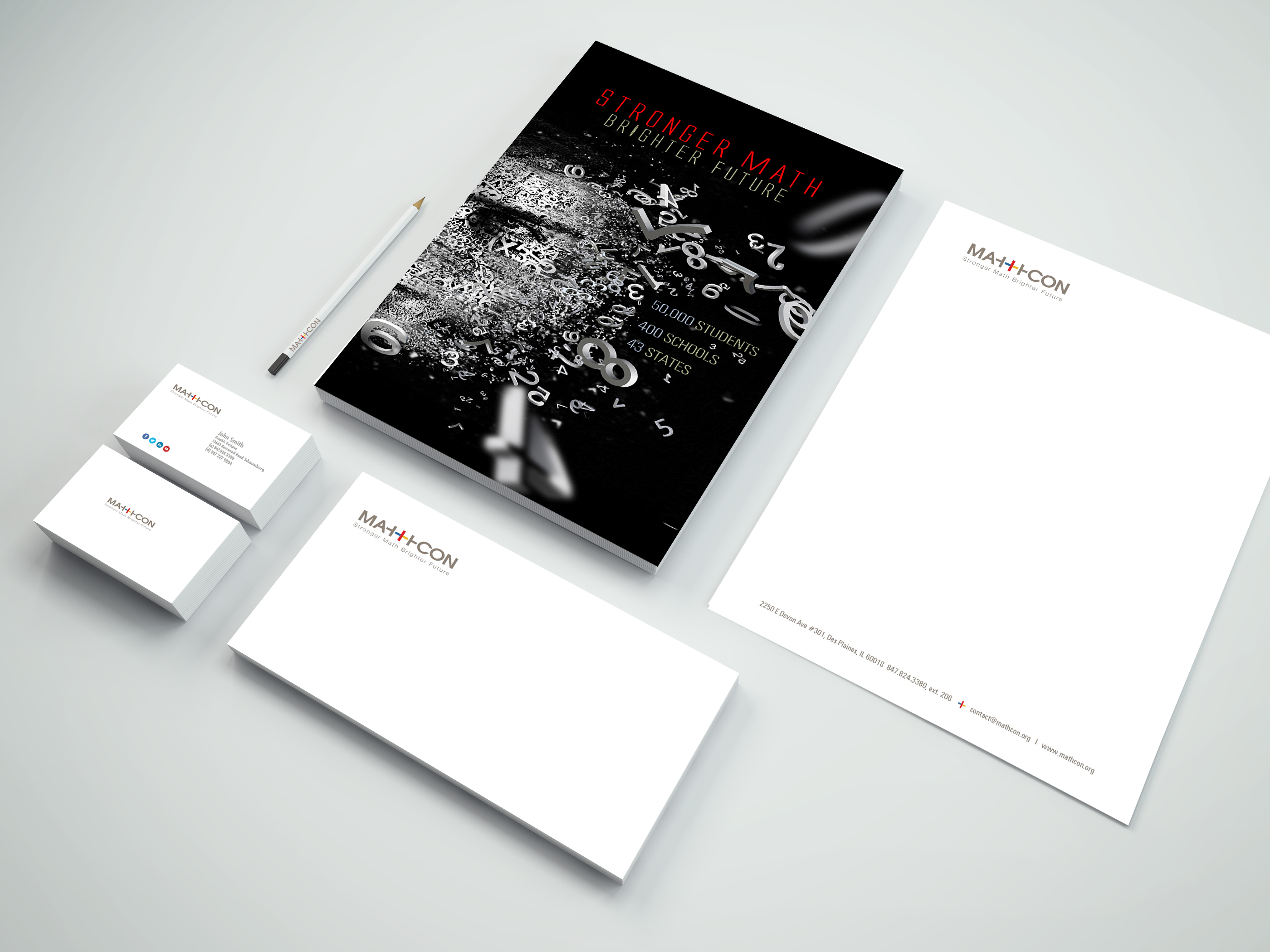
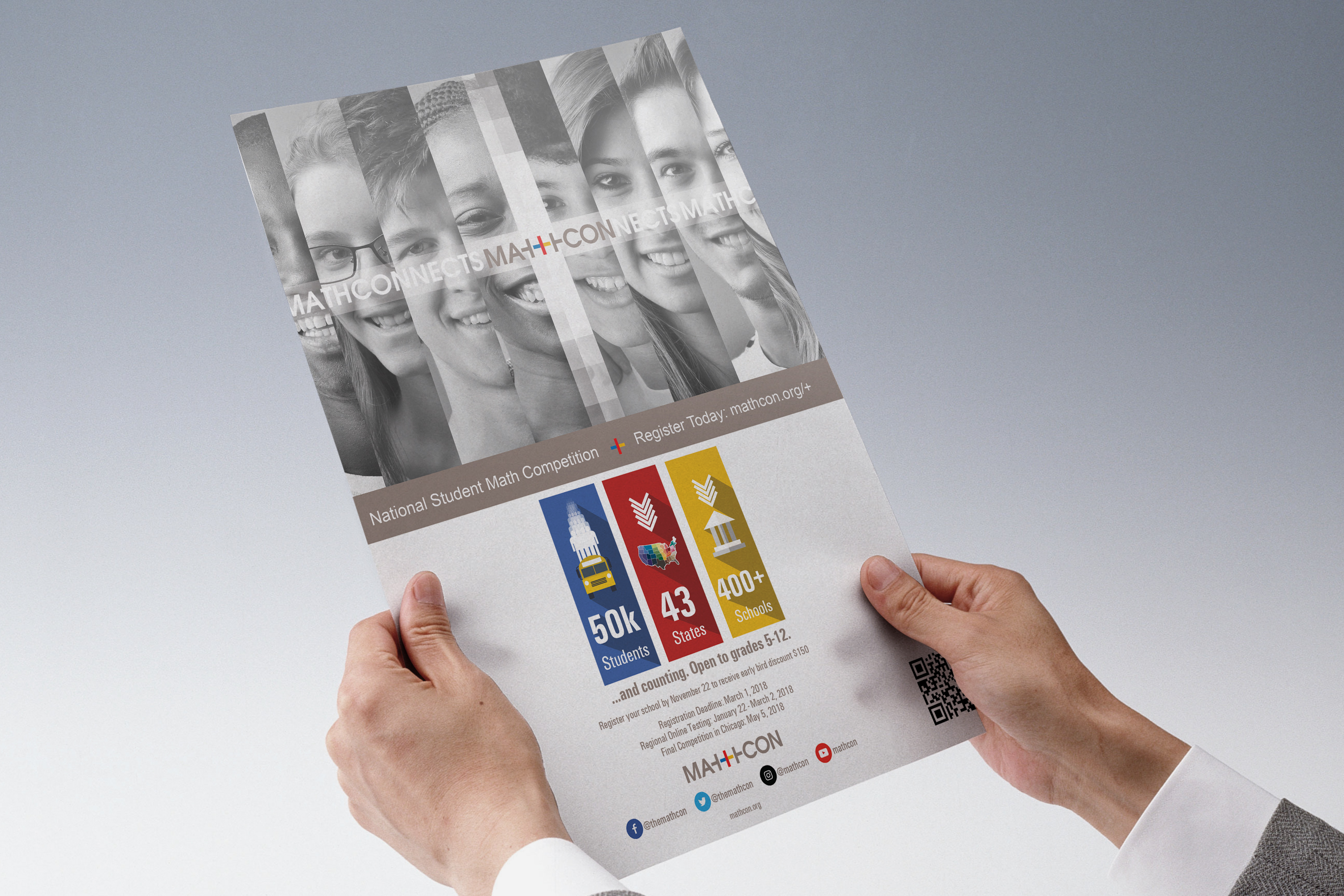
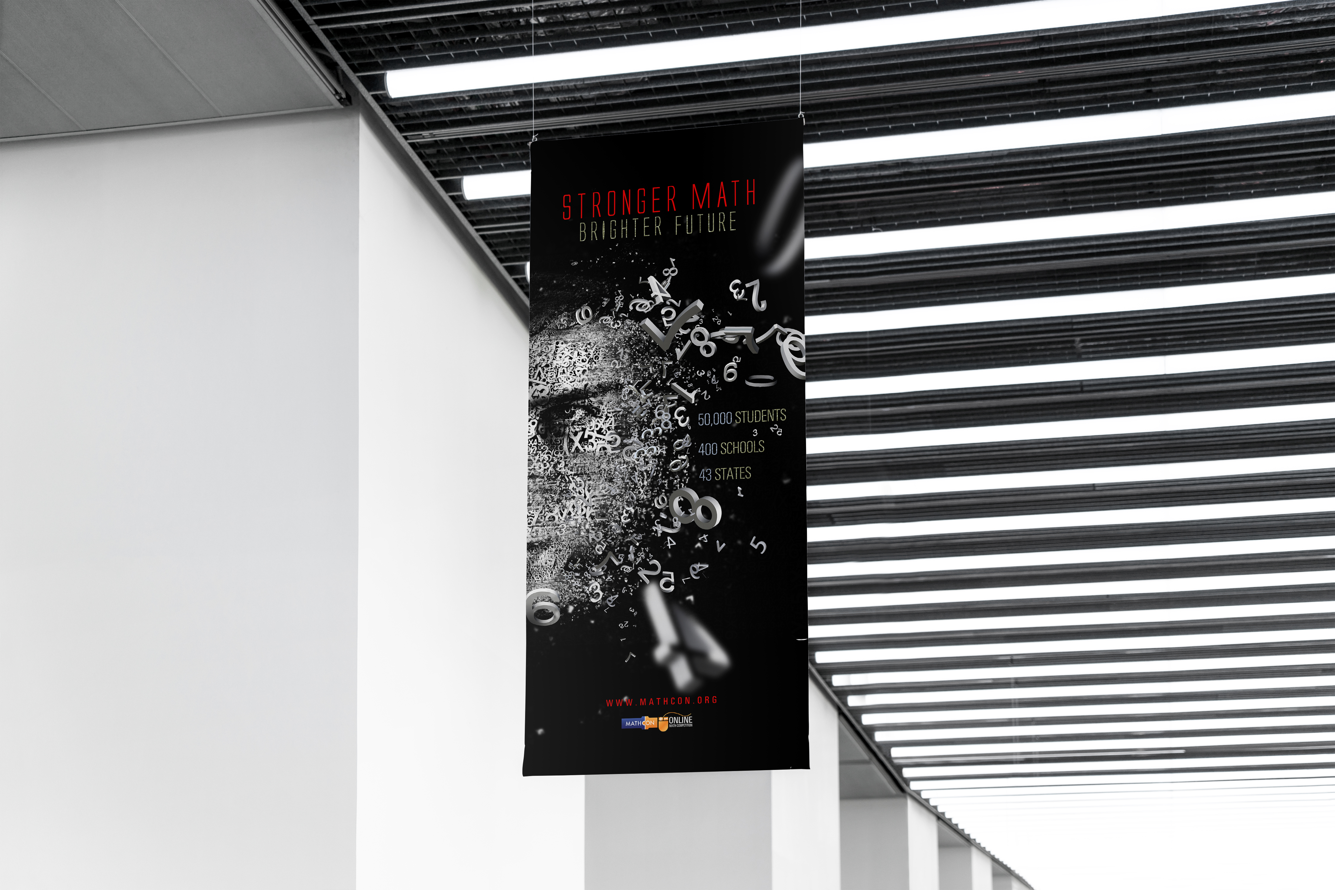
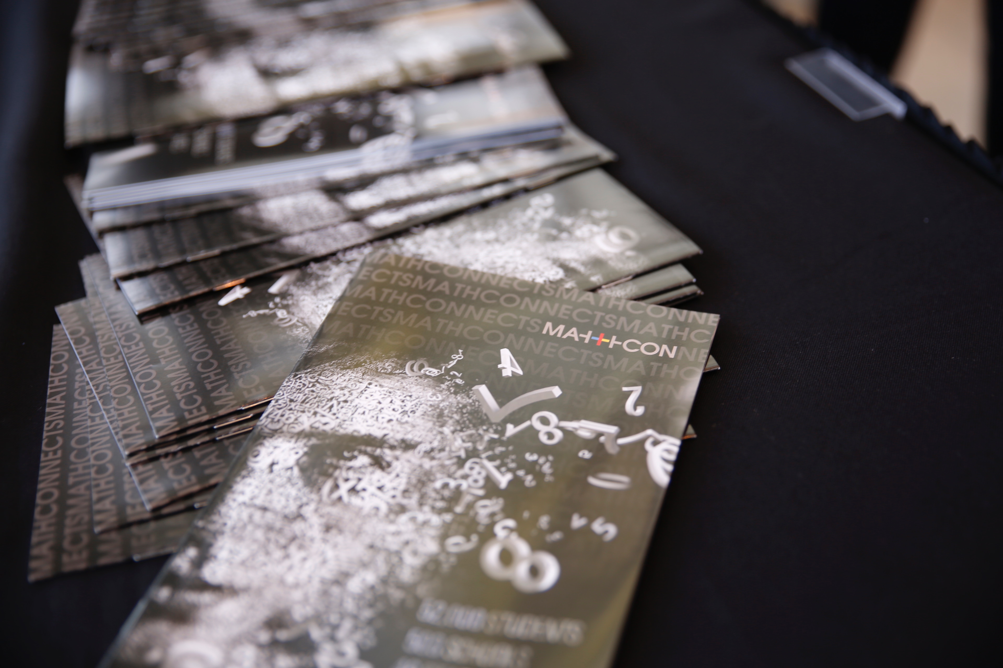
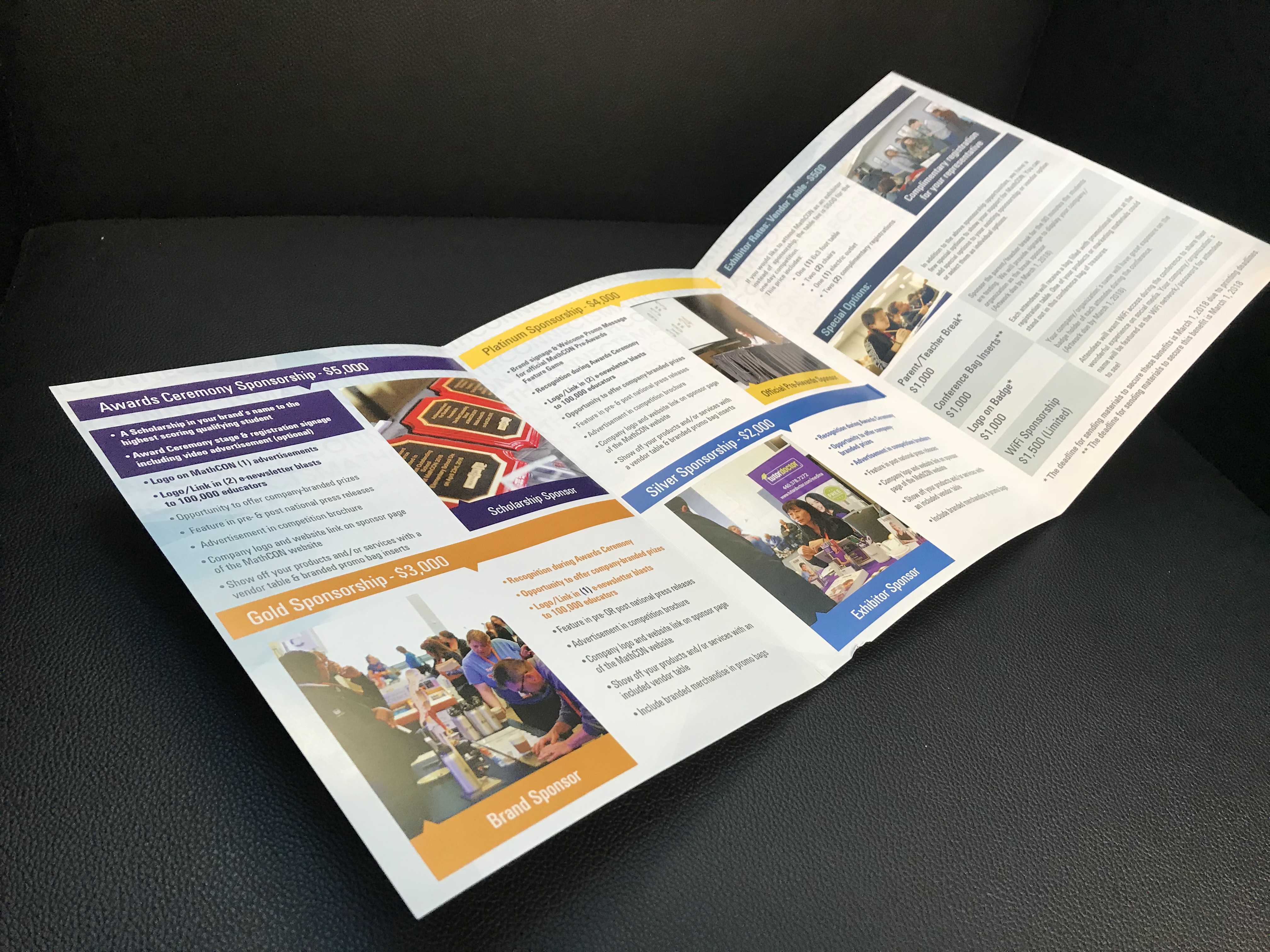
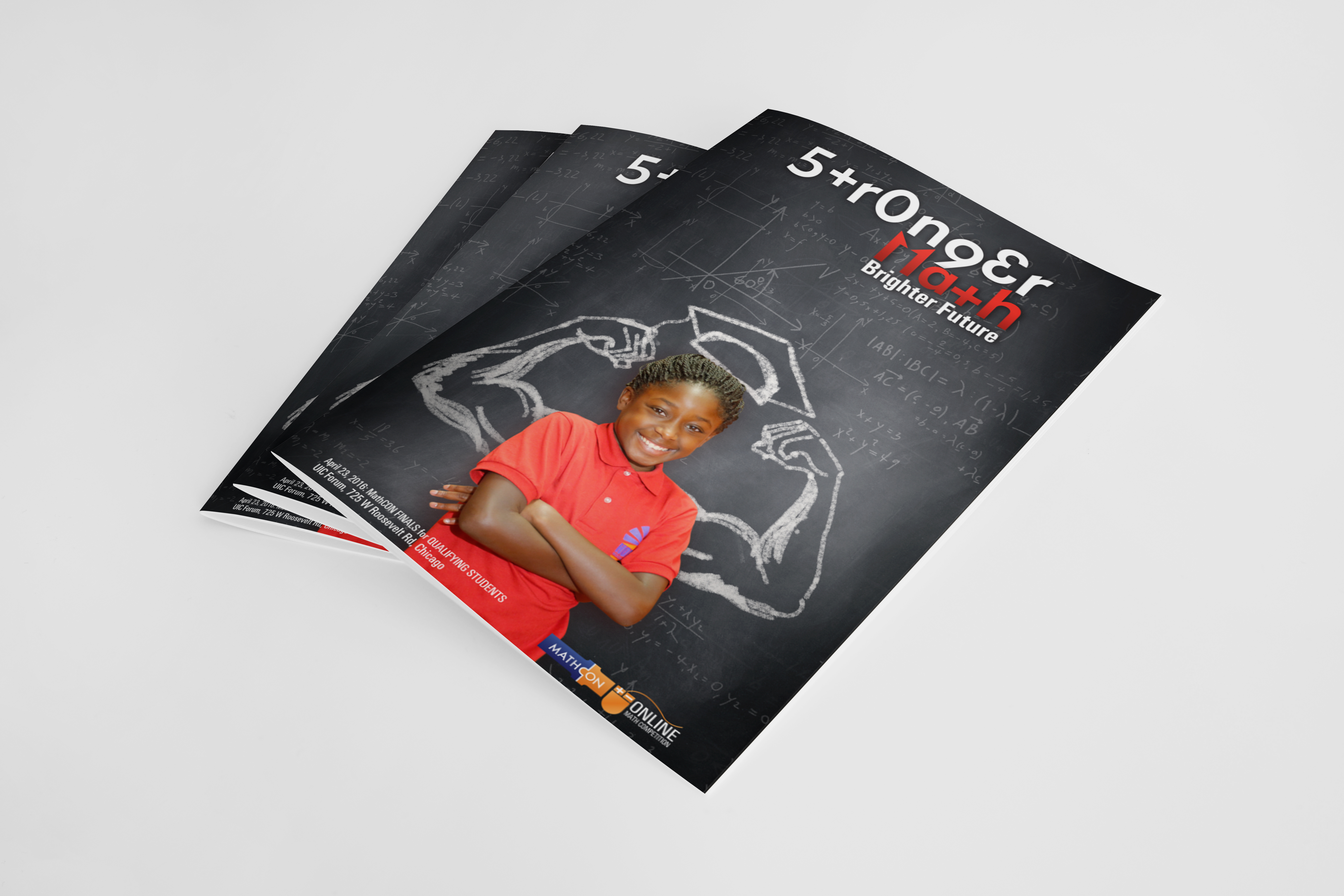
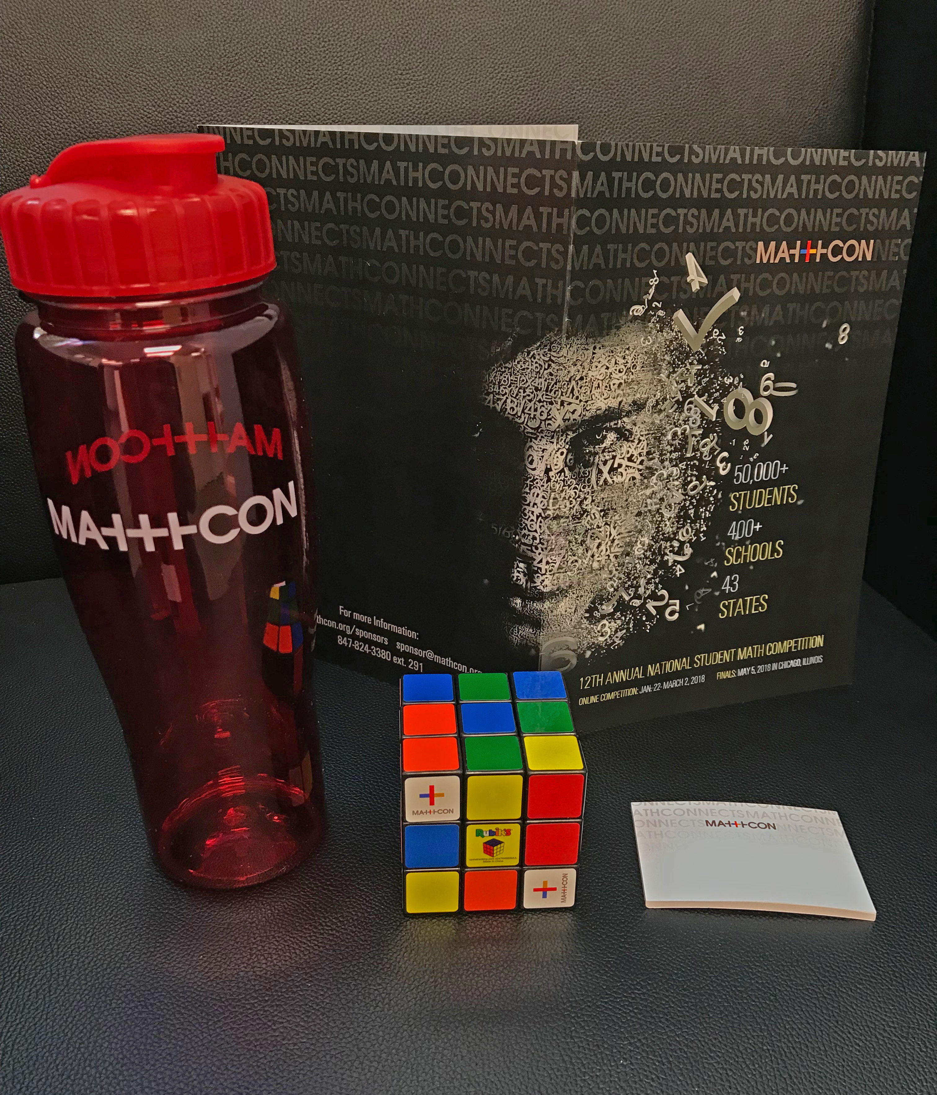
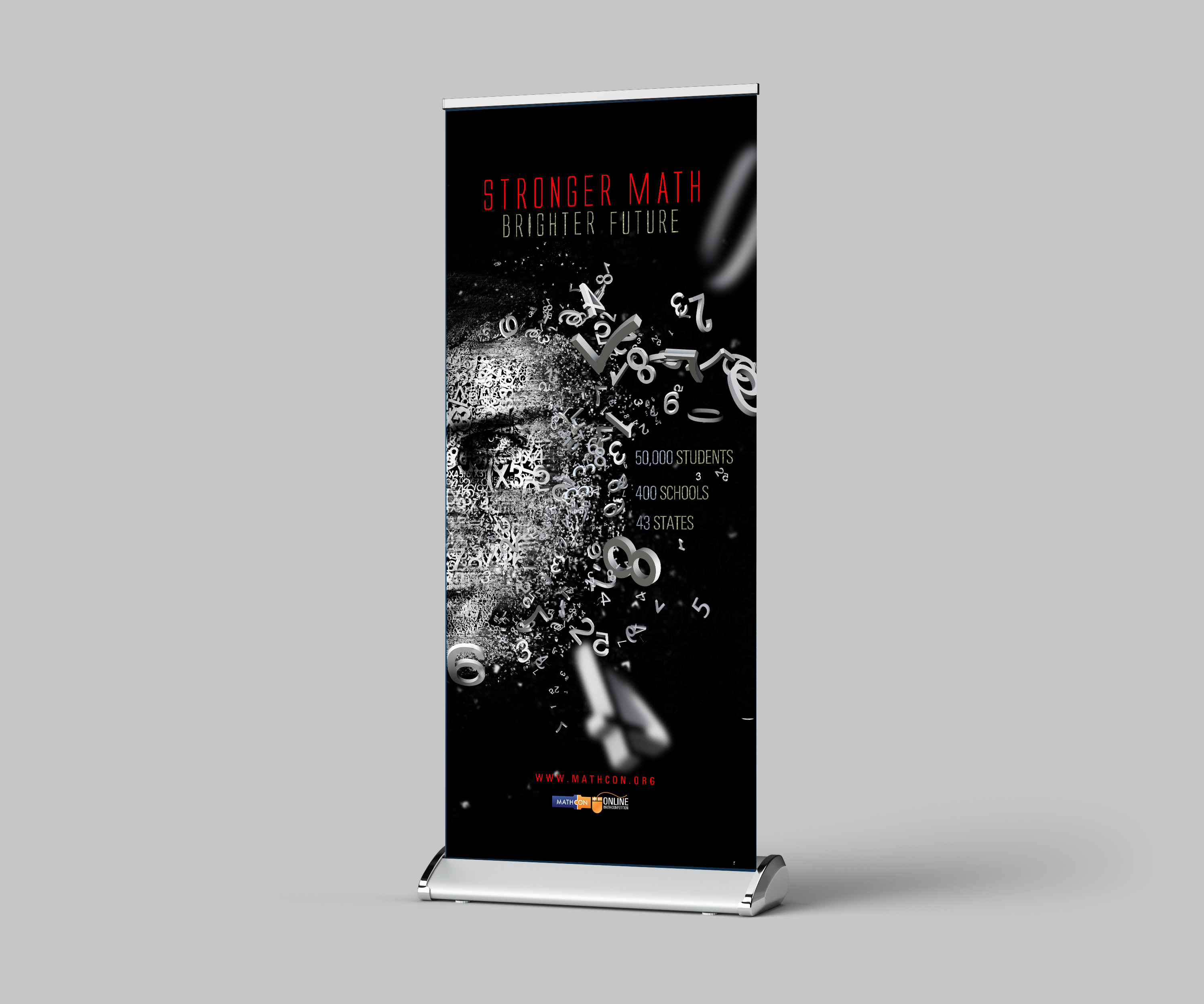
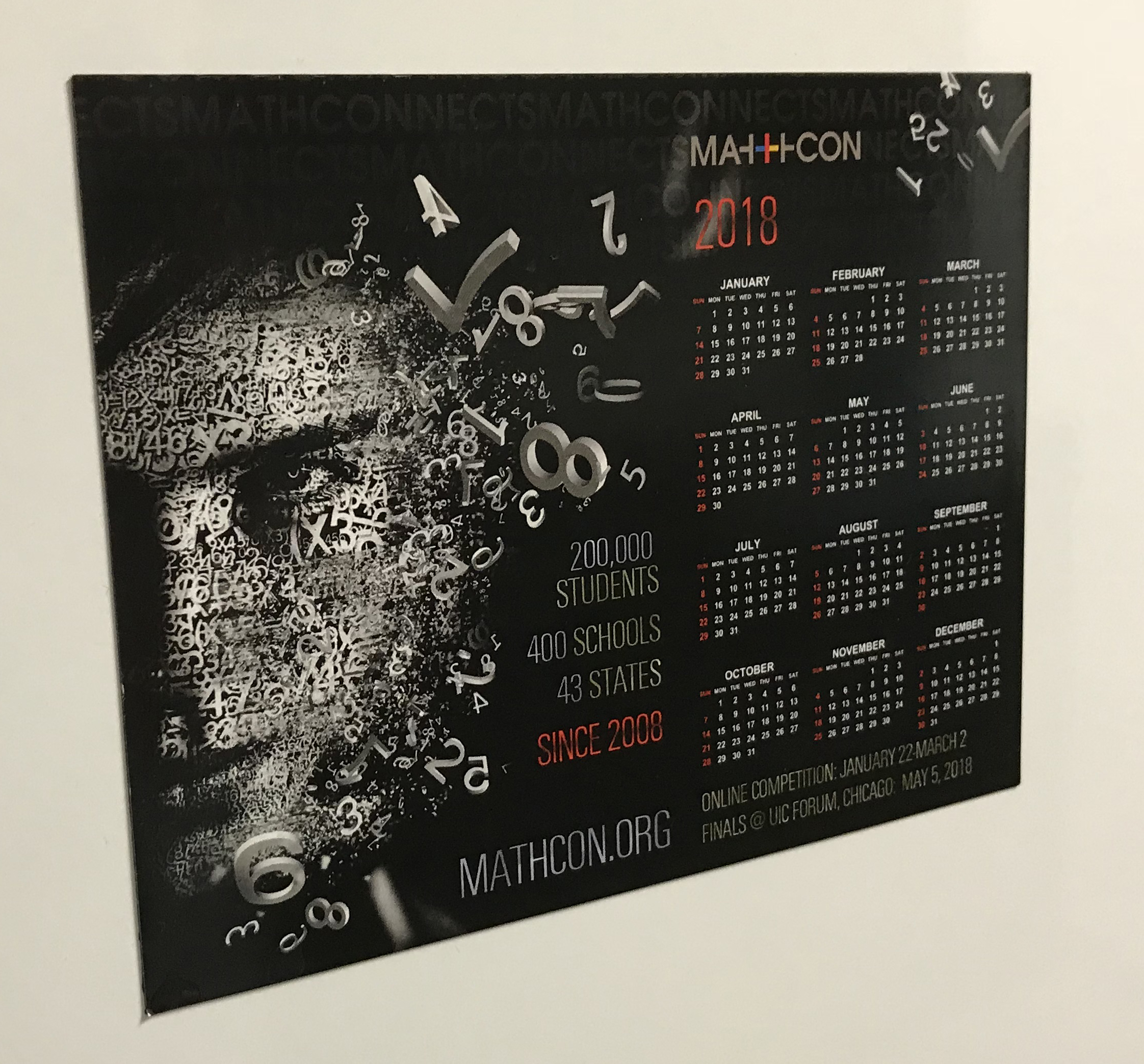
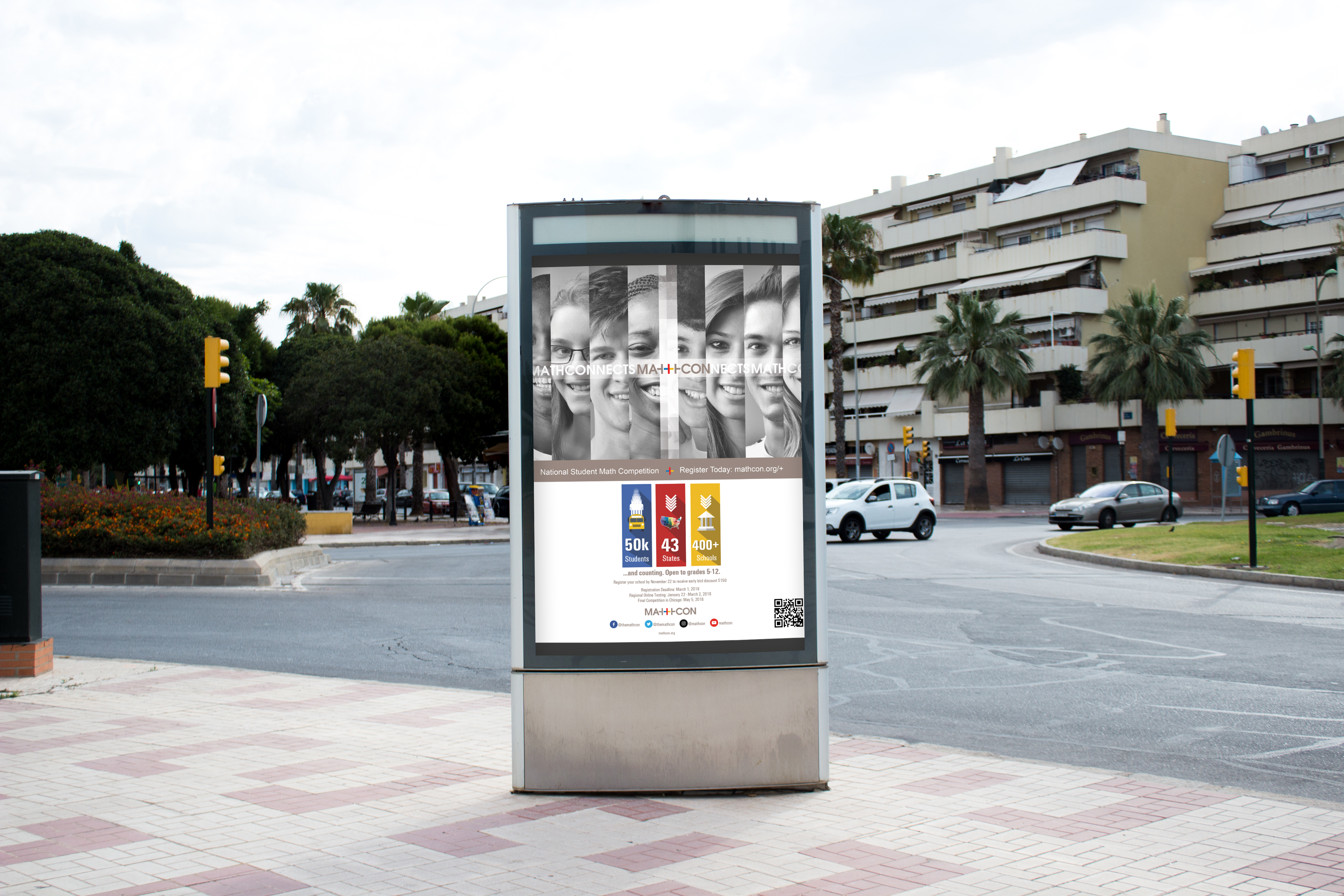
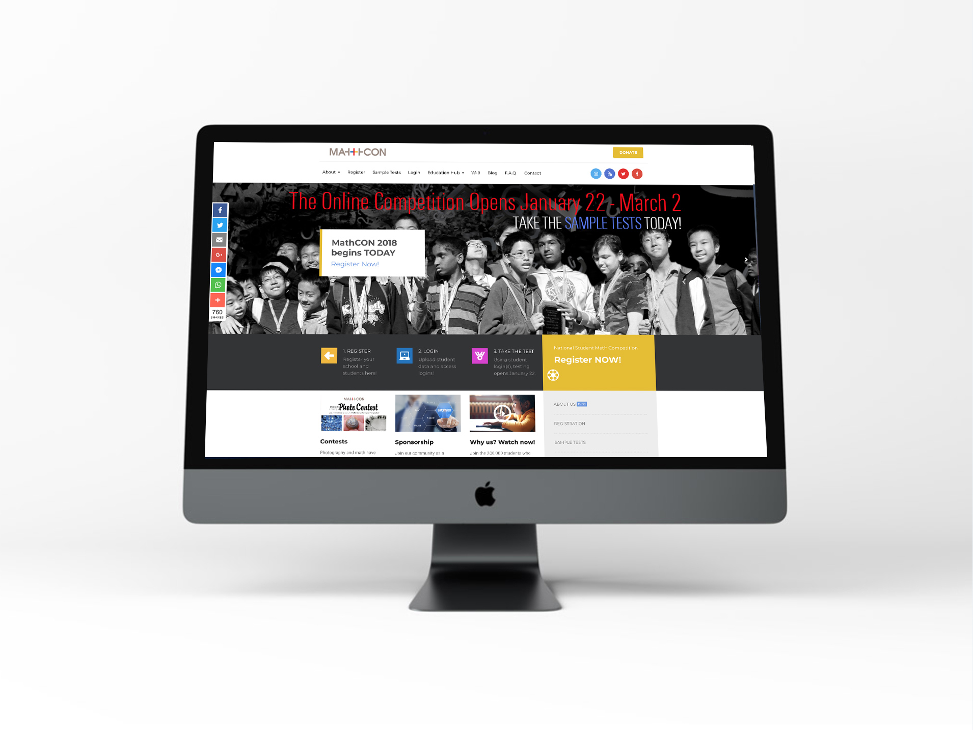
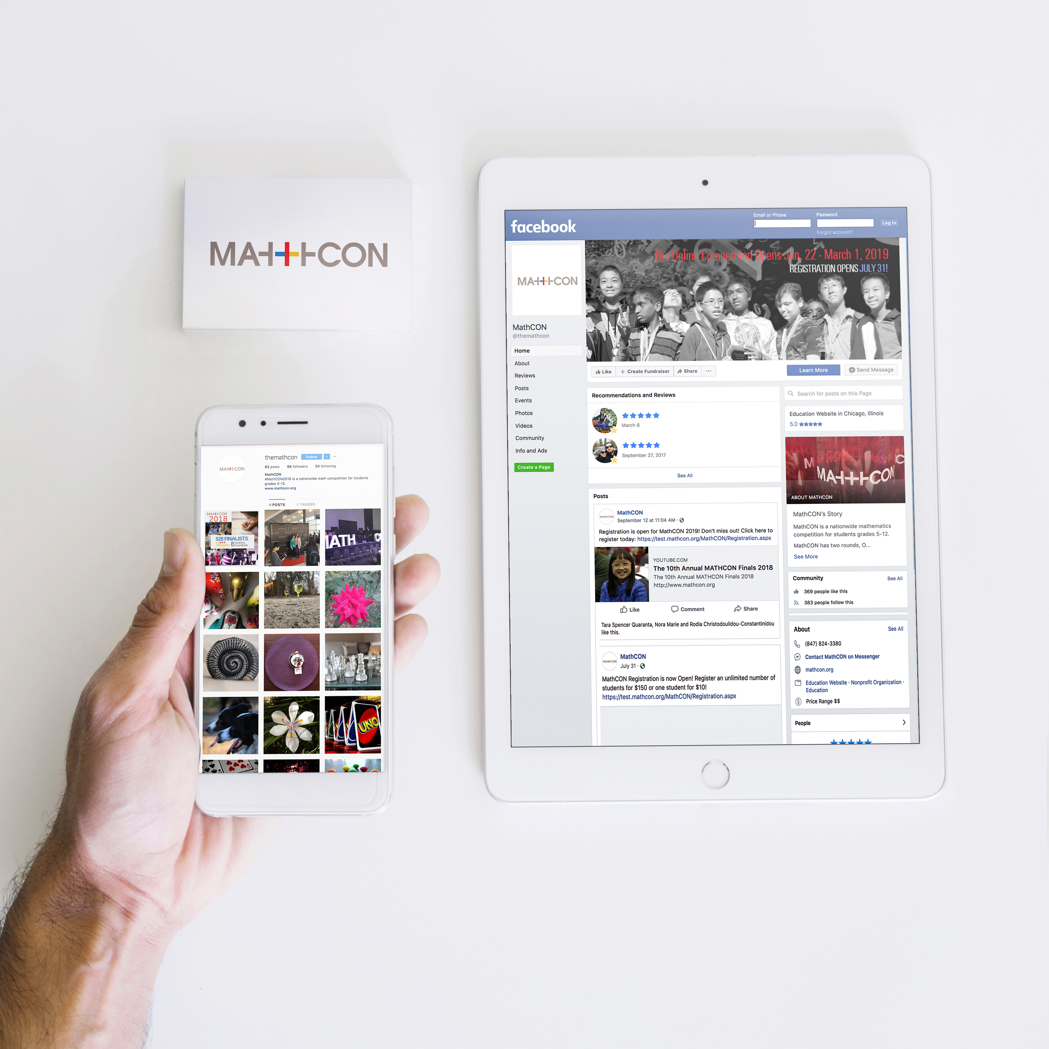
MathCON is a national math competition that has grown tremendously over the last several years. From its inception as a small competition with Chicago-based students to a national competition with over 50,000 students competing in the online round, we have overseen the brand development and rebrand of this inspiring organization.In 2018, MathCON overwent an entire brand overhaul. With a new website, logo, and an expanded vision, we were able to successfully grow MathCON’s brand with the blossoming organization.While the idea of “Stronger Math, Brighter Future” carried over to the rebrand, the new logo plays into the theme Math Connects. A minimalistic design, the plus symbol in the center of the logo connects the two ends of ‘MathCON’ and represents the connective nature of MathCON as a hub for math enthusiasts around the nation. The plus symbol is a combination of blue, red, and yellow, which are the three primary colors in nature. Just as these primary colors can be found in every color we see, math is underlying everything we see and experience.
CLIENT
MathCon
DELIVERABLES
Photography / Graphic / Web / Video


